You must first be logged in to post a new topic.
If you are not registered, please click "Create Account".
| Posted By |
Message |
| Pages: [1] 2 |
LIMOMx2
...
Member since 5/05 24989 total posts
Name:
|
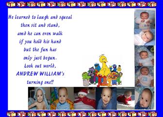
Do you think the border is too much on Andrews Invites?
I am trying to make my own from ones I have seen on here (thanks for the ideas  ) and other ones I have seen. ) and other ones I have seen.
Do you think the blocks border is too much?
TIA
I have been working on these forever
ETA: The wording is so far left because I am going to put his 1st B-day Pic above the sesame street characters. Maybe I will leave it for now until I get his picture taken Image Attachment(s):
Message edited 3/6/2007 10:39:42 PM.
|
Posted 3/6/07 8:47 PM  |
| |
|
Long Island Weddings
Long Island's Largest Bridal Resource |
november12003
Love my boys...

Member since 5/05 2412 total posts
Name:
Jenn
|
Re: Do you think the border is too much on Andrews Invites?
Don't see anything...
|
| Posted 3/6/07 8:51 PM |
| |
|
|
|
Re: Do you think the border is too much on Andrews Invites?
I would take out the border and then move the SS characters up more so it is a little more centered. I would also bring the wording a little to the left.
Otherwise I think it is adorable.
|
| Posted 3/6/07 9:04 PM |
| |
|
LIMOMx2
...
Member since 5/05 24989 total posts
Name:
|
Re: Do you think the border is too much on Andrews Invites?
Oh sorry I forgot to add that when I take Andrew for his 1st B-day pics I will put a larger picture of him right above the Sesame Street Characters
|
| Posted 3/6/07 9:06 PM |
| |
|
BabyAvocado
Happy New Year

Member since 5/05 17334 total posts
Name:
|
Re: Do you think the border is too much on Andrews Invites?
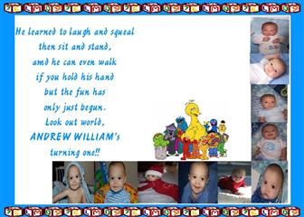
Actually, I would take out the blue border and leave the blocks. See what that looks like.
Or make the blue border a softer shade and spread out the blocks a little more (if you can) so there are less blocks.
|
| Posted 3/6/07 9:09 PM |
| |
|
LIMOMx2
...
Member since 5/05 24989 total posts
Name:
|
Re: Do you think the border is too much on Andrews Invites?
The blocks are all together. How about with a lighter blue?
I think I like that better! Thanks for the tip
Image Attachment(s):
|
| Posted 3/6/07 9:14 PM |
| |
|
BabyAvocado
Happy New Year
Member since 5/05 17334 total posts
Name:
|
Re: Do you think the border is too much on Andrews Invites?
Yep - I like the lighter blue better!
|
| Posted 3/6/07 9:25 PM |
| |
|
Stefanie
♥

Member since 5/05 23599 total posts
Name:
Stefanie
|
Re: Do you think the border is too much on Andrews Invites?
I don't know...I think it would look nice if the wording was centered. Maybe you could have the writing go over the sesame street characters and make them opaque.
|
| Posted 3/6/07 9:36 PM |
| |
|
MelToddJulia
Love my Family!

Member since 7/05 29064 total posts
Name:
Mel
|
Re: Do you think the border is too much on Andrews Invites?
Posted by Stefanie
I don't know...I think it would look nice if the wording was centered. Maybe you could have the writing go over the sesame street characters and make them opaque.
I agree w/ Stefanie, that would look really nice!
|
| Posted 3/6/07 10:01 PM |
| |
|
CunningOne
***
Member since 5/05 26975 total posts
Name:
|
Re: Do you think the border is too much on Andrews Invites?
I like the light blue better too and it makes the blocks stand out more. And I agree with what Stefanie said.
|
| Posted 3/6/07 10:04 PM |
| |
|
Corinne
My munchkins

Member since 5/05 5010 total posts
Name:
corinne
|
Re: Do you think the border is too much on Andrews Invites?
if your going to add a professional picture you probably dont need so many little ones it may make the inviation way to busy. the border is to distracting i would stick with either sesame street or blocks. i didnt know where to look first when i opened it. its a good start.
|
| Posted 3/6/07 10:05 PM |
| |
|
justthe4ofus
I hate hypocrites!!!!!

Member since 5/05 6905 total posts
Name:
|
Re: Do you think the border is too much on Andrews Invites?
Posted by Corinne
if your going to add a professional picture you probably dont need so many little ones it may make the inviation way to busy. the border is to distracting i would stick with either sesame street or blocks. i didnt know where to look first when i opened it. its a good start.
I agree or I would make the little picture more spread out and going around as the border with the prof. picture centered and the wording underneath it.
|
| Posted 3/6/07 10:08 PM |
| |
|
nrthshgrl
It goes fast. Pay attention.

Member since 7/05 57538 total posts
Name:
|
Re: Do you think the border is too much on Andrews Invites?
Posted by Corinne
if your going to add a professional picture you probably dont need so many little ones it may make the inviation way to busy. the border is to distracting i would stick with either sesame street or blocks. i didnt know where to look first when i opened it. its a good start.
I agree. Or I would flip the photos starting at the top middle to the end & working your way down the right side. I'm not crazy about the empty space at the top. If you do that you can make the font bigger & centered more. They're aligned to far to the left IMO.
|
| Posted 3/6/07 10:15 PM |
| |
|
WoodIAm
My Boys!

Member since 5/05 5498 total posts
Name:
JoAnne
|
Re: Do you think the border is too much on Andrews Invites?
I like Stephanie's idea. Either that or I wold have either the border OR the characters. I love the idea of alll the pictures!
|
| Posted 3/6/07 10:30 PM |
| |
|
LIMOMx2
...
Member since 5/05 24989 total posts
Name:
|
Re: Do you think the border is too much on Andrews Invites?
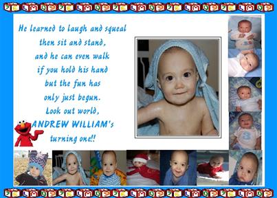
How about this one? I put in "fake" pictures for now to get a better idea of things.
I think maybe I will keep elmo and get rid of the blocks.
What do you think?
Without the border looks so much like someone else's on here. I hope she doesn't mind
 Image Attachment(s):
Message edited 3/7/2007 12:32:41 AM.
|
| Posted 3/7/07 12:25 AM |
| |
|
|
|
Re: Do you think the border is too much on Andrews Invites?
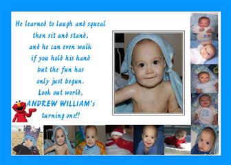
The second one is so much better. It is definitly not distracting now.
|
| Posted 3/7/07 7:41 AM |
| |
|
WoodIAm
My Boys!
Member since 5/05 5498 total posts
Name:
JoAnne
|
Re: Do you think the border is too much on Andrews Invites?
It looks great!! I love the litlle Elmo holding up Andrew's name!
|
| Posted 3/7/07 7:54 AM |
| |
|
joenick
Us

Member since 6/06 9370 total posts
Name:
Valerie...aka...Do Me A Favor?
|
Re: Do you think the border is too much on Andrews Invites?
The second one looks adorable!!
|
| Posted 3/7/07 8:04 AM |
| |
|
Annemarie13
LIF Adolescent

Member since 5/05 628 total posts
Name:
Annemarie
|
Re: Do you think the border is too much on Andrews Invites?
love the 2nd one. Trying to find similiar invites for my son's 1st b-day in May. What program are you using to make them?
|
| Posted 3/7/07 8:15 AM |
| |
|
november12003
Love my boys...
Member since 5/05 2412 total posts
Name:
Jenn
|
Re: Do you think the border is too much on Andrews Invites?
I love the 2nd one!!
|
| Posted 3/7/07 8:36 AM |
| |
|
MelToddJulia
Love my Family!
Member since 7/05 29064 total posts
Name:
Mel
|
Re: Do you think the border is too much on Andrews Invites?
Thats the same wording I did on Julia's 1st b-day invites last year!
|
| Posted 3/7/07 8:39 AM |
| |
|
LIMOMx2
...
Member since 5/05 24989 total posts
Name:
|
Re: Do you think the border is too much on Andrews Invites?
Thank you everyone. I have been trying so hard to get them right
I am using Printmaster.
|
| Posted 3/7/07 8:44 AM |
| |
|
NJmom
.
Member since 8/05 4987 total posts
Name:
|
Re: Do you think the border is too much on Andrews Invites?
much better without the blocks!
|
| Posted 3/7/07 8:58 AM |
| |
|
LIMOMx2
...
Member since 5/05 24989 total posts
Name:
|
Re: Do you think the border is too much on Andrews Invites?
Does anyone know of a place in Nassau or even Suffolk to have them printed up? I really don't want to do it myself.
TIA
|
| Posted 3/7/07 10:38 AM |
| |
|
Stefanie
♥
Member since 5/05 23599 total posts
Name:
Stefanie
|
Re: Do you think the border is too much on Andrews Invites?
You could bring them to Kinkos.
I like the 2nd one better too. Good job!
|
| Posted 3/7/07 11:31 AM |
| |
|
| Pages: [1] 2 |