You must first be logged in to post a new topic.
If you are not registered, please click "Create Account".
| Posted By |
Message |
Ophelia
she's baaccckkkk ;)

Member since 5/06 23378 total posts
Name:
remember, when Gulliver traveled....
|
Design mistakes and missteps...what do you do when you realize something has gone awry
so, we need to change something in our den.
between the paint color (which I really like on it's own) and the rug (again, that I like on it's own) the color grey is overwhelming.
even putting up paintings and other decor on the walls is not helping.
dh is more unnerved by it than I am. he loves color. different colors. and the grey is getting to him.
personally, I'd rather leave the walls and rip up the carpet..but we spent $100 on paint, and $500 on the carpet, so that would just be stupid on my part.
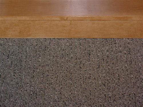
so now we have to find a color for the walls of our den that we both like, and that goes with the carpet, which is grey with flecks of white and brown in it.
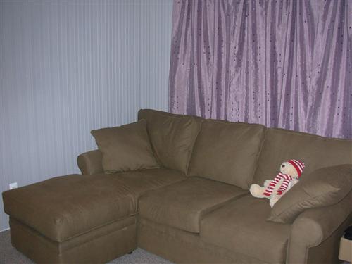
we are not generally white/off white/beige people and sadly grey is out. our sofa is like the color of chocolate malt.
curtains can be easily changed so I am not worried about clashing with that.
some pics.
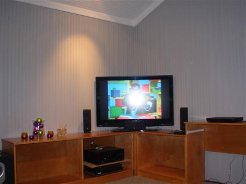
our walls (and please also note the color of the stain on the cabinetry)
our carpet
main piece of artwork (too expensive to toss to the side, plus we like it)

I was thinking maybe we could also slip cover the sofa (the color has not grown on my dh   ) )
anyone have any ideas for me...particularly and especially regarding paint color? the room gets a TON of light and sun...but it's on the smaller side (around 12 x12 or so) I am just unsure where to go from here. that beadboard is a ***** to pain! 
TIA.
|
Posted 8/5/09 12:02 PM  |
| |
|
Long Island Weddings
Long Island's Largest Bridal Resource | Prudential Douglas Elliman Real Estate |
greenfreak
.

Member since 9/06 11483 total posts
Name:
greenfreak
|
Re: Design mistakes and missteps...what do you do when you realize something has gone awry
You could get away with a really vibrant patterned area rug right in the middle to anchor the room. We kept to solids for our living room but have a few "busy" things like vibrant throw pillows.
Sorry, don't have any other suggestions!
|
| Posted 8/5/09 12:10 PM |
| |
|
jgl
Love my little boys!!!

Member since 8/07 7060 total posts
Name:
g
|
Re: Design mistakes and missteps...what do you do when you realize something has gone awry
i dont knwo what specific color but i think a green may work in there. maybe a darker olive green color
if you go here.. Benjamin Moore
and click paint your digital pictures. it costs $10 to download the program. you can trace the area you want to paint and then pick BM colors you think may work and get an idea how it will look. we did this for the ourside of our house. the colors dont look exactly the color because of the computer but it will give you a good idea.
Message edited 8/5/2009 12:20:13 PM.
|
| Posted 8/5/09 12:15 PM |
| |
|
JldDolphin

Member since 1/07 6929 total posts
Name:
Jen
|
Re: Design mistakes and missteps...what do you do when you realize something has gone awry
I would def. play off the slate blue it looks like in the art. Love it. and the couch will go with the slate blue. I love blue and brown together. Buy slate blue patterned pillows to go with the art work....something fun. Maybe just sheers for the curtains.
ETA: and for a pop of color buy a vase or something that has that orange color from the artwork. It would look great in the room. Or even buy one pillow that has the orange color in it. You will make that great piece of artwork pop off the wall.
Message edited 8/5/2009 12:22:06 PM.
|
| Posted 8/5/09 12:20 PM |
| |
|
jgl
Love my little boys!!!
Member since 8/07 7060 total posts
Name:
g
|
Re: Design mistakes and missteps...what do you do when you realize something has gone awry
Posted by JldDolphin
I would def. play off the slate blue it looks like in the art. Love it. and the couch will go with the slate blue. I love blue and brown together. Buy slate blue patterned pillows to go with the art work....something fun. Maybe just sheers for the curtains.
IMAGE
good thinking i like the idea of the blue!
Message edited 8/5/2009 12:22:59 PM.
|
| Posted 8/5/09 12:21 PM |
| |
|
JldDolphin
Member since 1/07 6929 total posts
Name:
Jen
|
Re: Design mistakes and missteps...what do you do when you realize something has gone awry
Check out this site
They have lots of blue rooms with browns in the room. Hopefully it will give you some inspiration for your room.

|
| Posted 8/5/09 12:44 PM |
| |
|
DRMom
Two in Blue

Member since 5/05 20223 total posts
Name:
Melissa
|
Re: Design mistakes and missteps...what do you do when you realize something has gone awry
Posted by jgl
Posted by JldDolphin
I would def. play off the slate blue it looks like in the art. Love it. and the couch will go with the slate blue. I love blue and brown together. Buy slate blue patterned pillows to go with the art work....something fun. Maybe just sheers for the curtains.
IMAGE
good thinking i like the idea of the blue!
Great idea-I also like this!
|
| Posted 8/5/09 12:46 PM |
| |
|
babymakes3
Almost there!

Member since 7/06 7376 total posts
Name:
|
Re: Design mistakes and missteps...what do you do when you realize something has gone awry
I agree with the other poster about playing off the slate blue in the piece, but I would paint the whole room in that color or a shade darker. I like a den to feel close and cozy and that darker color would do that.
BM has a historical color near that called Yorktowne Green. Maybe that would work? Or you could get it color matched and go one shade darker.
|
| Posted 8/5/09 12:50 PM |
| |
|
CurlyQ

Member since 6/07 2024 total posts
Name:
|
Re: Design mistakes and missteps...what do you do when you realize something has gone awry
I was also thinking a lighter/slate blue color would work nice. I am thinking maybe BM brittney blue.
|
| Posted 8/5/09 12:54 PM |
| |
|
Ophelia
she's baaccckkkk ;)
Member since 5/06 23378 total posts
Name:
remember, when Gulliver traveled....
|
Re: Design mistakes and missteps...what do you do when you realize something has gone awry
hmmm....I like the idea of using a nice blue. do you think it would work with the grey carpet?
we have some throw pillows now..these pics are old..in the colors in the artwork.
I am really digging the pop of orange, so that's kind of our direction now.
I don't want my den to look like Mr. Met though 
|
| Posted 8/5/09 2:44 PM |
| |
|
Otherme
Square head cutie pants

Member since 3/06 6899 total posts
Name:
|
Re: Design mistakes and missteps...what do you do when you realize something has gone awry
If the carpet has flecks of brown in it, and your cabinets are that warm golden color.. how about trying a warm taupe color? There are plenty of taupes that would compliment both the grey and brown in the rug and would still go with the cabinets.
|
| Posted 8/5/09 3:45 PM |
| |
|
JldDolphin
Member since 1/07 6929 total posts
Name:
Jen
|
Re: Design mistakes and missteps...what do you do when you realize something has gone awry
blue and gray go togther.
Yup you don't want it looking like Mr. Met. That is why the orange is just a pop of color, not a large splash of color. And you have the brown couch to break things up. Plus you aren't going to pick a bright blue like Mr. Met is. 

|
| Posted 8/5/09 3:46 PM |
| |
|
JldDolphin
Member since 1/07 6929 total posts
Name:
Jen
|
Re: Design mistakes and missteps...what do you do when you realize something has gone awry
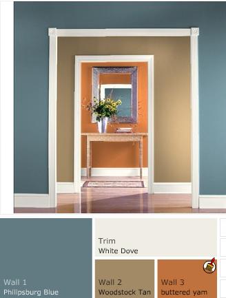
something like this maybe. Blue would be the walls, the tan represents your couch and the orange in the back is the pop of color. HTH!
ETA: if you want, go into Benjamin Moore's website (these colors are from there) and put in a gray instead of the white so you can see gray with all the other colors.
Message edited 8/5/2009 4:12:35 PM.
|
| Posted 8/5/09 4:11 PM |
| |
|
Ophelia
she's baaccckkkk ;)
Member since 5/06 23378 total posts
Name:
remember, when Gulliver traveled....
|
Re: Design mistakes and missteps...what do you do when you realize something has gone awry
Posted by JldDolphin
something like this maybe. Blue would be the walls, the tan represents your couch and the orange in the back is the pop of color. HTH!
ETA: if you want, go into Benjamin Moore's website (these colors are from there) and put in a gray instead of the white so you can see gray with all the other colors.
IMAGE
I LIKE this! I like YOU even more  thank you!!!! thank you!!!!
|
| Posted 8/5/09 4:27 PM |
| |
|
JldDolphin
Member since 1/07 6929 total posts
Name:
Jen
|
Re: Design mistakes and missteps...what do you do when you realize something has gone awry
Posted by Ophelia
Posted by JldDolphin
something like this maybe. Blue would be the walls, the tan represents your couch and the orange in the back is the pop of color. HTH!
ETA: if you want, go into Benjamin Moore's website (these colors are from there) and put in a gray instead of the white so you can see gray with all the other colors.
IMAGE
I LIKE this! I like YOU even more thank you!!!!
Glad I could help! 
|
| Posted 8/5/09 5:09 PM |
| |
|
DandN
Twins are here!

Member since 3/06 3597 total posts
Name:
Deirdre
|
Re: Design mistakes and missteps...what do you do when you realize something has gone awry
Orange is my favorite color - it's a fabulous accent color - don't be afraid of it!!!!!!!
Some designer wrote that orange gets very jealous - so it only works as an accent color. I'm not really sure what that means - but for little 'pops' of color I think it can't be beat.
I agree with what the other posters wrote about making the walls blue - the color combo would be great.
|
| Posted 8/5/09 11:58 PM |
| |
|
Sparkyandang
LIF Adolescent
Member since 5/08 766 total posts
Name:
Ang
|
Re: Design mistakes and missteps...what do you do when you realize something has gone awry
Posted by JldDolphin
Posted by Ophelia
Posted by JldDolphin
something like this maybe. Blue would be the walls, the tan represents your couch and the orange in the back is the pop of color. HTH!
ETA: if you want, go into Benjamin Moore's website (these colors are from there) and put in a gray instead of the white so you can see gray with all the other colors.
IMAGE
I LIKE this! I like YOU even more thank you!!!!
Glad I could help!
jen you are very very good at this!!!! always have great ideas! I hope you'll still be willing to help in a few weeks when I close.
|
| Posted 8/6/09 9:51 AM |
| |
|
shiv
Twinsanity!!

Member since 5/07 4747 total posts
Name:
Shiv
|
Re: Design mistakes and missteps...what do you do when you realize something has gone awry
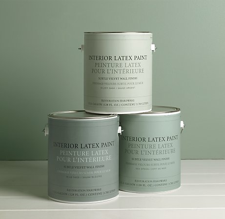
silver sage- it goes with almost anything and is such a soothing beautiful color.
We bought our paint from restoration hardware- we used the silver sage, sea green and blue sage in the collection for the different rooms on our first floor (Kithcen, LR/Den and DR) which is all open so the colors just flow together. The silver sage is suttle but beautiful. If you want something bold I would go for the Blue Sage.
website:
RH paint Image Attachment(s):
Message edited 8/6/2009 10:32:02 AM.
|
| Posted 8/6/09 10:31 AM |
| |
|
smdl
I love Gary too..on a plate!
Member since 5/06 32461 total posts
Name:
me
|
Re: Design mistakes and missteps...what do you do when you realize something has gone awry
Posted by Ophelia
Posted by JldDolphin
something like this maybe. Blue would be the walls, the tan represents your couch and the orange in the back is the pop of color. HTH!
ETA: if you want, go into Benjamin Moore's website (these colors are from there) and put in a gray instead of the white so you can see gray with all the other colors.
IMAGE
I LIKE this! I like YOU even more thank you!!!!
I like this color theme and was going to suggest that burned orangy color with that blue.
I like the cream with it.
Great choice.
|
| Posted 8/6/09 10:55 AM |
| |
|