

Bith Announcement - needs feedback
| Posted By | Message |
|---|---|
|
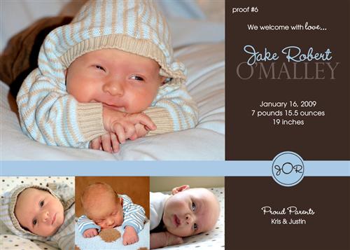
Bith Announcement - needs feedback So, here is a proof of Jake's birth annoucement. Something is bothering me about it, and I think its the bottom three photos. Message edited 2009-03-04 13:10:41.323000. |
|
Posted 3/4/09 1:08 PM 
|
|
|
Long Island Weddings
Long Island's Largest Bridal Resource
| |
|
Re: Bith Announcement - needs feedback On thing that sticks out is you're missing the time he was born. Message edited 2009-03-04 13:26:09.757000. |
|
|
Posted 3/4/09 1:24 PM
|
|
|
Re: Bith Announcement - needs feedback I agree with the middle photo. I think it's the background that might be throwing it off. All of the photos are soft, but this one pops too much (wood background). I do love that photo though. |
|
|
Posted 3/4/09 1:35 PM
|
|
|
Re: Bith Announcement - needs feedback love it...but I really like big pic and 2 pics on bottom on the sides. middle pic takes away from them. |
|
|
Posted 3/4/09 1:35 PM
|
|
|
Re: Bith Announcement - needs feedback Posted by Janice love it...but I really like big pic and 2 pics on bottom on the sides. middle pic takes away from them. I agree. OMG, top photo is ADORABLE!!! |
|
|
Posted 3/4/09 1:38 PM
|
|
|
Re: Bith Announcement - needs feedback i LOVE the top pic...i think you should enlarge just that one and use it with the sidebar for info..what an adorable lil guy!! |
|
|
Posted 3/4/09 1:40 PM
|
|
|
Re: Bith Announcement - needs feedback Posted by nrthshgrl On thing that sticks out is you're missing the time he was born. I would get rid of the middle photo & try it with 2. I also think it would look cuter with only one photos - the top photo enlarged. Then extend the blue bar only to the side of that photo I completely agree with this. The first picture is incredible- I want to see more of this amazing face. 
|
|
|
Posted 3/4/09 1:40 PM
|
|
|
Re: Bith Announcement - needs feedback I agree with the middle picture...although I think it looks great the way it is. |
|
|
Posted 3/4/09 1:59 PM
|
|


 Just my opinion though.


Potentially Related Topics:
| Topic | Posted By | Started | Replies | Forum |
|---|---|---|---|---|
| Needs some opinions/feedback - Christmas Card | Ang-Rich | 11/4/08 | 31 | Parenting |