

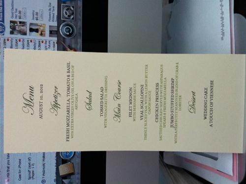
Critique my menu (layout & fonts).
| Posted By | Message |
|---|---|
|
Critique my menu (layout & fonts). Do you think this looks okay? Is there anything you would change in the layout or fonts? |
|
Posted 6/9/12 4:56 PM 
|
|
|
Long Island Weddings
Long Island's Largest Bridal Resource
| |
|
Re: Critique my menu (layout & fonts). I think it looks beautiful! |
|
|
Posted 6/9/12 5:07 PM
|
|
|
Re: Critique my menu (layout & fonts). My eyes aren't great. Can you confirm that you spelled virgin correctly? It look like it ends in en. |
|
|
Posted 6/9/12 5:19 PM
|
|
|
Re: Critique my menu (layout & fonts). It looks great! I would (if you have the time) add a monogram or your names on the top. |
|
|
Posted 6/9/12 5:42 PM
|
|
|
Re: Critique my menu (layout & fonts). I like the fonts and layout. You have some spelling errors though. |
|
|
Posted 6/9/12 5:46 PM
|
|
|
Re: Critique my menu (layout & fonts). I just checked and there's no "e" at the end on virgin. |
|
|
Posted 6/9/12 5:56 PM
|
|
|
Re: Critique my menu (layout & fonts). It looks pretty! |
|
|
Posted 6/9/12 6:11 PM
|
|
|
Re: Critique my menu (layout & fonts). Posted by rojerono It looks pretty! There are a couple of words that are spelled incorrectly.. but it may just be that I can't see straight! Bernaise should be Béarnaise Vinegarette should be Vinaigrette I agree that it might be nice to have your Initials or names at the top and I like the idea of adding descriptions to the desserts for continuity. SUPER nitpicky.. but I might tweak the description of the jumbo shrimp.. I am sure you meant that it's stuffed with lobster and crab.. but it almost seems like the lobster and crab are separate. But great job! I love the font and the layout! Okay, so I fixed all the spellings and added a description to the cake. How would you write the description for the Jumbo Shrimp? My brain is fried after all things wedding lately. 
|
|
|
Posted 6/9/12 6:36 PM
|
|
|
Re: Critique my menu (layout & fonts). Also virgin, arugula and do you mean a "caper" sauce on the veal? You have capon. |
|
|
Posted 6/9/12 7:41 PM
|
|
|
Re: Critique my menu (layout & fonts). Love the fonts. Check how centered all the titles are. I feel that someone of them are off. |
|
|
Posted 6/9/12 8:16 PM
|
|
|
Re: Critique my menu (layout & fonts). I only caught the Arugula mistake |
|
|
Posted 6/9/12 8:38 PM
|
|
|
Re: Critique my menu (layout & fonts). Font's are great. Can't read the text bc it's too small and blurry when I zoom in. I feel like it needs "something". I'm adding the menu I designed for our wedding. It has some flourish designs in between the courses, our monogram from our invite on top and I played up the descriptions a bit. |
|
|
Posted 6/10/12 12:01 AM
|
|
|
Re: Critique my menu (layout & fonts). You guys are awesome! Thanks! |
|
|
Posted 6/10/12 12:49 PM
|
|
|
Re: Critique my menu (layout & fonts). Looks good. Very classic. Maybe if you can't get a monogram to work (I'm not a big fan of monograms for myself, but I know a lot of people like them), then you can put it on a colorful pieve of backing paper, or add a ribbon or brad to the top to make it more cusomized |
|
|
Posted 6/11/12 2:05 PM
|
|









Potentially Related Topics:
| Topic | Posted By | Started | Replies | Forum |
|---|---|---|---|---|
| Can you critique my 1st birthday baseball party menu? | CloudNine | 5/24/12 | 21 | Parenting |
| Critique my Easter menu - do I need another protein? | Carolyn | 4/4/12 | 11 | Dining In or Out |
| Please critique my xmas menu. Suggestions? | Newly1 | 12/16/10 | 2 | Dining In or Out |
| baby shower menu...critique mine por favor!!! | Ophelia | 7/10/09 | 28 | Pregnancy |
| Pleae critique my menu.... | CookiePuss | 4/10/09 | 11 | Dining In or Out |
| Please critique my block party menu | Carolyn | 8/25/08 | 7 | Dining In or Out |