|
need honest opinions
Posted 2/12/2008 8:43:20 PM by HeathKernandez Long story short... I painted these for my husband to hang above his DJ equipment.  I was having trouble with what color to paint the background and decided on using a complimentary color to the wall perpendicular to it... which is burnt orange:  I decided on a blue-green.. but wanted to do it a little lighter to make the breakdancers 'pop'. The original background I mixed came out to powdery blue and DH wasn't too fond of it... so I remixed it and didn't realize until this mornig that it was too green: 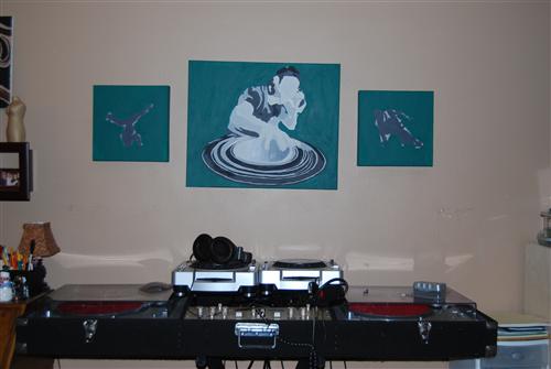 (please don't mind the crookedness...) I'm definitely going to outline the dancers in white or light gray to distinguish them from the background... I know it works... it's actually similar to the color of my kitchen and picks up colors from my couch, so it makes the room flow... but i am JUsT NOT content with it and want to rework it... Thing is, with acrylics... if you layer them TOO MUCH it can be more problematic.. and I dont want to make it worse. You can already start to see a *clumping* and brush strokes in it (but only when looking close) HOW BAD does it look... should I take a chance and go lighter? |